How to Make a Flyer on a Mac
Flyers are paper advertisements distributed in a public place, handed out to individuals or sent through the mail. These are persuasive documents aimed to get the reader to act. Whether you want to announce an upcoming event or sell a product or service, a flyer will help you get your message out. In this article, we will explain general guidelines you might find useful when designing your flyers.
Step 1: Plan the Layout
Before designing your flyer, you need to choose the page size. The most popular sizes are US Letter and Half-Letter (or A4 and A5, accordingly). Then you should think about the composition. Most often, there will be one central image–the one that sells the message–and accompanying text. There is a basic rule for the text: less is more. As very few people are going to glance at it for more than a second, your information must be divided into easily readable sections.
Other things to keep in mind:
Use Alignment
Use vertical and horizontal alignment guides to neatly lay out your objects. Consider using a grid system–a series of intersecting lines resulting in rows and columns. Don’t forget to leave enough space between the edge of the page and the content.
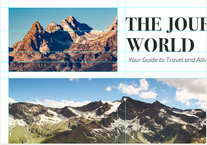
Avoid Clutter
If your flyer is too crowded, it will be hard to read it quickly and will be likely to end up in trash. Adjust the elements so that they have enough space around them.
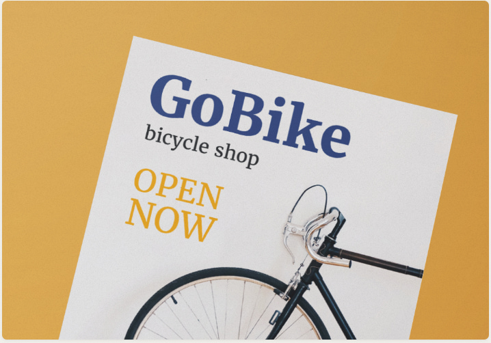
Utilize Contrast
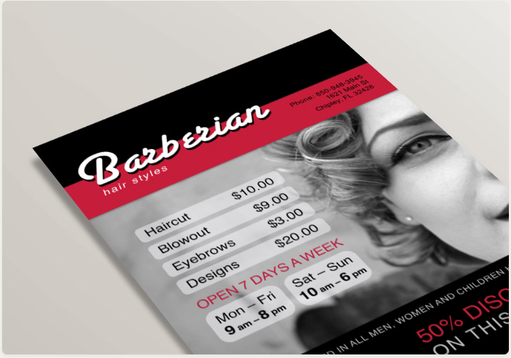
Combine dark images with light texts, or vice versa, to help grab viewers’ attention.
Account for Bleed
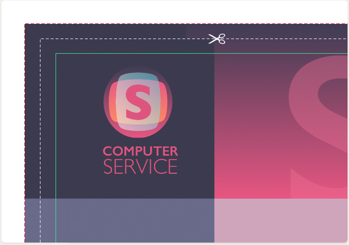
If you’re going to print your flyer on a home printer, note that many printers can’t print close to the edge of the paper. In this case, don’t position text and graphics too close to the borders of your design.
If your printer is capable of printing to the edge, or you’re going to use a commercial service, use a technique called full bleed. This means that your graphics and background have to go slightly beyond the borders of the flyer, increasing the size of your document. The paper is then trimmed to its intended size after printing.
Step 2: Prepare Your Graphics
Since the flyer has limited space, you need to choose one main image. Unless you’re planning to use your own pictures, there are a lot of image banks at your disposal on the internet.
For example, www.pixabay.com offers more than 1.4 million images that are free to use, even for commercial purposes.
Depositphotos.com is a paid service, containing an impressive 60 million royalty-free, professional quality photos and vector illustrations.
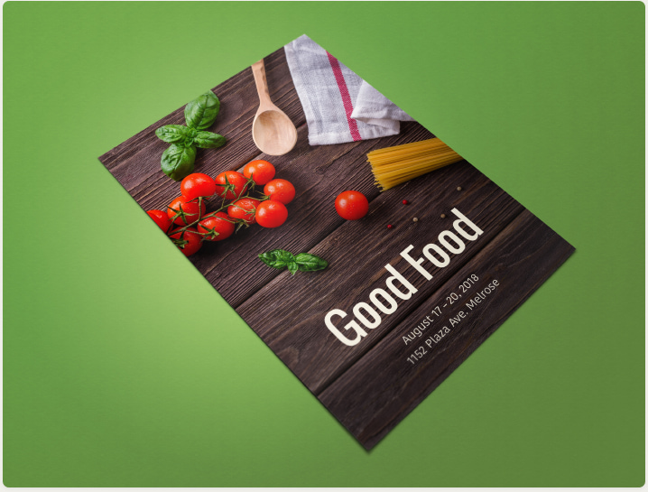
Plain text messages won’t grab as much attention as desired, so it’s important to enhance the information value. The best way is to determine what background and infographics details the flyer will include. Cluttering the layout with many bright and different-layered details won’t benefit you in the long run.
When choosing an image, make sure its resolution is high enough so you can print it at 300 dots per inch (DPI). You can easily verify if the image meets this criterion. If you divide the pixel dimensions of the image by 300, you will get the maximum size at which the image can be printed at good quality. For example, if your image is 2550 × 3300 pixels, its resolution is high enough to print on a US Letter sized page, which is 8.5 × 11 inches at 300 DPI.
Step 3: Present Your Message
A good flyer is laconic, professional and persuasive. Use a distinctive headline to catch readers’ attention. The headline doesn’t necessarily have to be placed at the top of the page, but it must stand out. Use a nice font or dedicated software, such as Art Text or Letters, to design an attractive heading.

Organize your text into sections answering the following three questions:
What?
Describe the essence of the event, product or service you’re offering, using as few words as possible. If you need to add a detailed description, use a smaller font.
Where?
Specify a complete street address, and make it more visually appealing by adding a map. You can also include driving directions or public transportation information here in a smaller type.
When?
Indicate date and time, mentioning any deadlines (e.g., if it’s a sale, when it expires). Don’t forget to run the spell checker before submitting the flyer to the printshop.

More Tips
- Don’t play with overly metaphoric descriptions and long sentences—you don’t want to sell a fairy tale. Your task is to present a particular product/service/event to your target audiences and engage them to the fullest extent. Choosing to have your information displayed in a brief and readable form won’t ever disappoint.
- Consider the visual appeal of the text. It is unnecessary to experiment with too many fonts or other text specifications. Instead, simply select separate fonts for crucial notes, headers and the main message body.
Step 4: Print Your Design
For a small-scale project, you may consider using a home printer. However, since it’s unlikely to be cost effective, the best choice is to use a professional service. You will be able to choose from a wide selection of different paper and enjoy better quality and lower prices.
Before submitting your project to a printshop, find out the requirements: file format, resolution and bleed size.
Ready to Design Your Own Flyers?
Now that you know the theory, it’s time for some hands-on experience.
Try Swift Publisher for Mac, an easy-to-use application that can be your gateway to the world of graphic design. Apart from being a powerful design tool, it includes hundreds of pre-designed templates and an extensive collection of royalty-free images.