Designing Custom Name Badges: A Beginner’s Guide
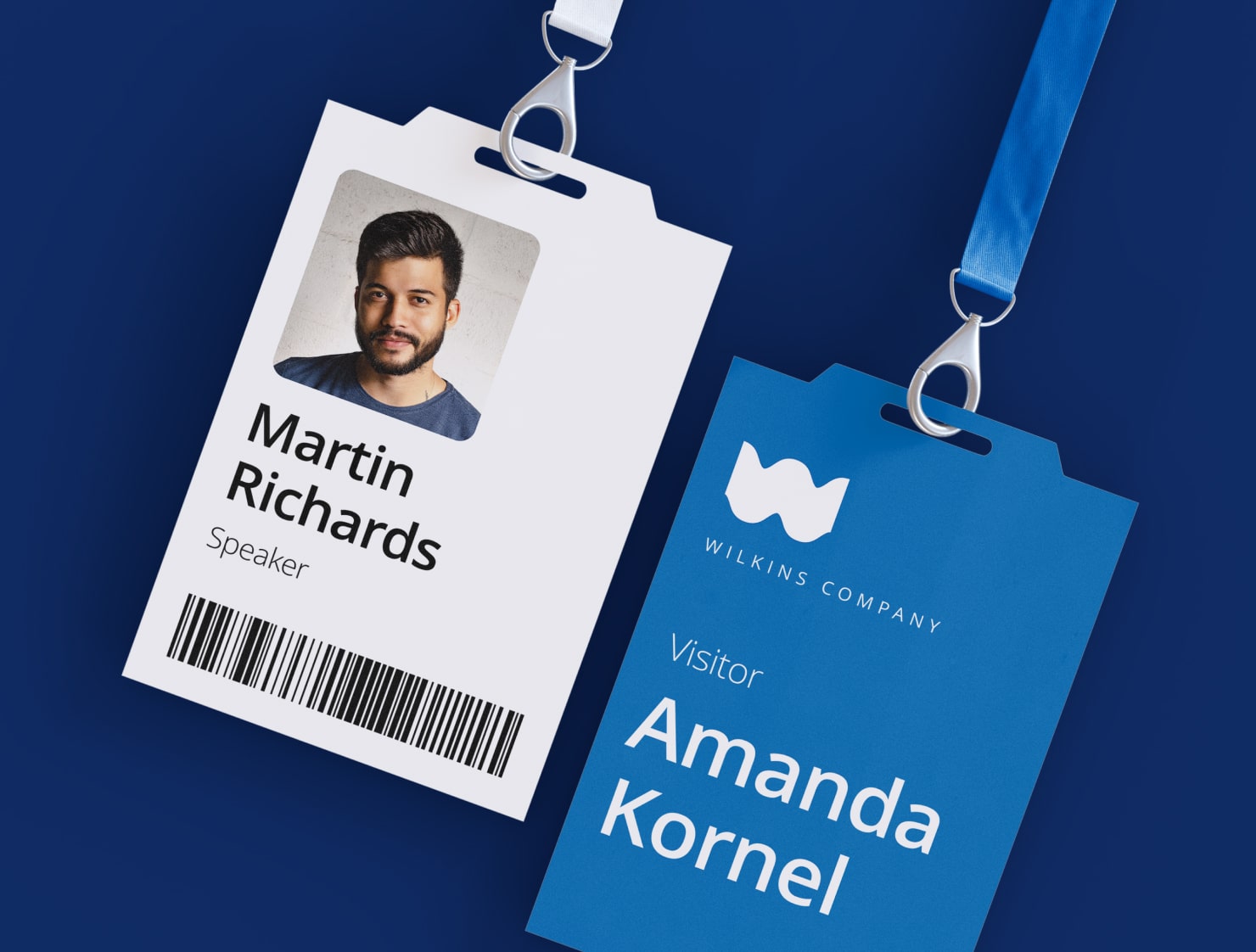
Name badges are small identification tags that individuals wear to events, conferences, gatherings or work. They play a central role in initiating communication between people who don’t know each other. And they can help create a sense of community in a new or unfamiliar setting.
Why Are Name Badges Important?
They serve as visual cues that make it easy to initiate conversations and remember people’s names, leading to more personal interactions and stronger professional networks.
Where Are They Used?
There is hardly a professional setting where name badges don’t make things easier and more friendly. Add someone’s title or job function, and they can establish credibility and foster networking opportunities. In schools and teaching environments, they promote inclusivity and facilitate friendship among students and faculty. They’re also helpful in settings where a professional group of people interact with new clients throughout the day, like in a medical office, or service desk. Name badges are ideal in settings of hospitality, like hotels and restaurants so customers can get oriented and feel welcome to ask for direction or assistance.
So now that we’ve established how infinitely useful badges are in all different settings, you may want to design and make your own. This article will guide you through designing a custom name tag. We will include easy steps and tips to help you create professional-looking name labels that align with your brand identity or event theme.
Factors to Consider When Designing a Custom Name Tag
Before you get started, there are a few points to consider before you begin the design. You will want to think about the purpose of the name badges, the material available to use, the size, shape and the colors of the badge and text: all of these we’ll cover below.
What’s the Purpose?
The first consideration when designing a custom name badge is understanding what it will be used for. Before diving into the design process, determine the event or occasion for which they will be used, as well as the impression you want to convey. This list of questions will help guide your design choices:
- What is the event or occasion that you’re designing for, e.g., a business conference, school function or a social or networking event?
- Will the name badges be worn once, or used repeatedly?
Understanding the environment where the name badges will be used will help you determine the overall design approach, including the choice of colors, fonts and graphic elements.
Material to Use for Your Name Tag
You’ll want to choose the material based on your event and how often the name badges will be worn. The material of your name badge plays a role in its durability and overall presentation. Consider the environment in which the name badges will be used.
For short-term events, such as conferences, paper or cardstock will work. These are placed in plastic inserts that use a pin for the wearer to attach to their clothing.
For easy and quick application, you’ll want to print a name badge on a sticker label.

But for more permanence and durability, choose plastic or metal. These can have a pin or a magnetic attachment. Just be sure that the material you select is compatible with the printing method you’re going to use.
Name Badges: Choosing Size and Shape
The size and shape of the name badge is hugely important so that people can read the text. Choose a size that allows the text to be easily legible from a distance. The most common shape is a 2.5″ × 3″ or 2″ × 4″ rectangle. And within the shape you have the option of rounded or square corners.
But don’t be afraid to experiment with other shapes if you aim for a more unique look. Consider oval or square if that works with your event design or brand.
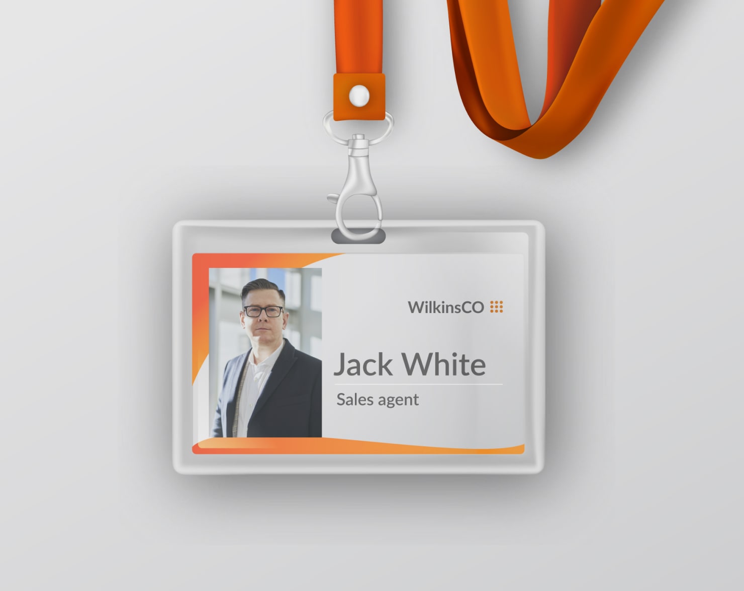
A main consideration for the size will be how much text you want to include. When designing, make sure you have allowed enough space for the text to be readable. For example, if a badge will only display a name, a smaller size, like 2″ × 3″ will work.
But say for instance, you’d like the name badge to contain all of the following:
- Name
- Professional title
- Place of work
- Home city
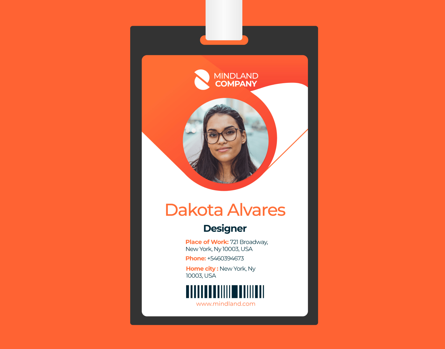
To include several lines of information, you will need a badge large enough that four lines of text remain readable from standing distance away. For larger badges, a height of 4″ is helpful for keeping the text large and readable.
Name Tag Color Scheme
Selecting an appropriate color scheme is essential for effective name badge design. The colors should fit your brand or event identity and provide enough contrast with the background and text so the name is readable.
The optimal scheme is dark text on a light background. But that doesn't mean you have to stick with black on white. Within that, you can align the colors with your brand identity or event theme to maintain consistency. Choose colors that not only reflect your brand or event theme, but also make it easy to read the text on the name tag. Experiment with color combinations to find the right balance between aesthetics and legibility.

Tips for Effective Design
The most important elements of a name badge are the font style, the logo and branding, and the text alignment and spacing. Here are helpful tips to help you choose how to design these elements so they work best for the kind of name badges you’re creating.
Font Selection
The most important priority in choosing a font for the name is legibility. After all, the goal is to make names easily readable when people approach each other.
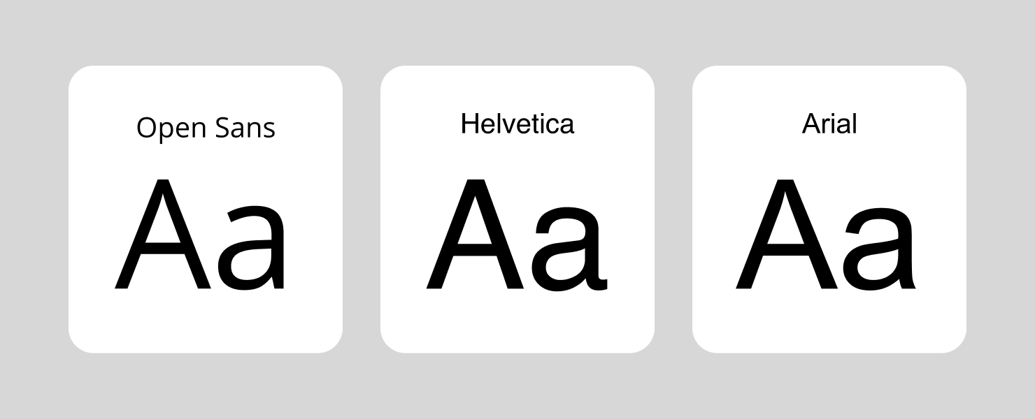
Choose clean, readable fonts, particularly for the main text. Sans-serif fonts like Arial, Helvetica, or Open Sans work well for this purpose. Bold font weights can also be a good choice.
If you want to use decorative or script fonts, reserve those for additional details other than the name, or to add headings, like the title of an event. Experiment with different font sizes to find the right balance between readability and visual appeal.
Logo Placement & Sizing
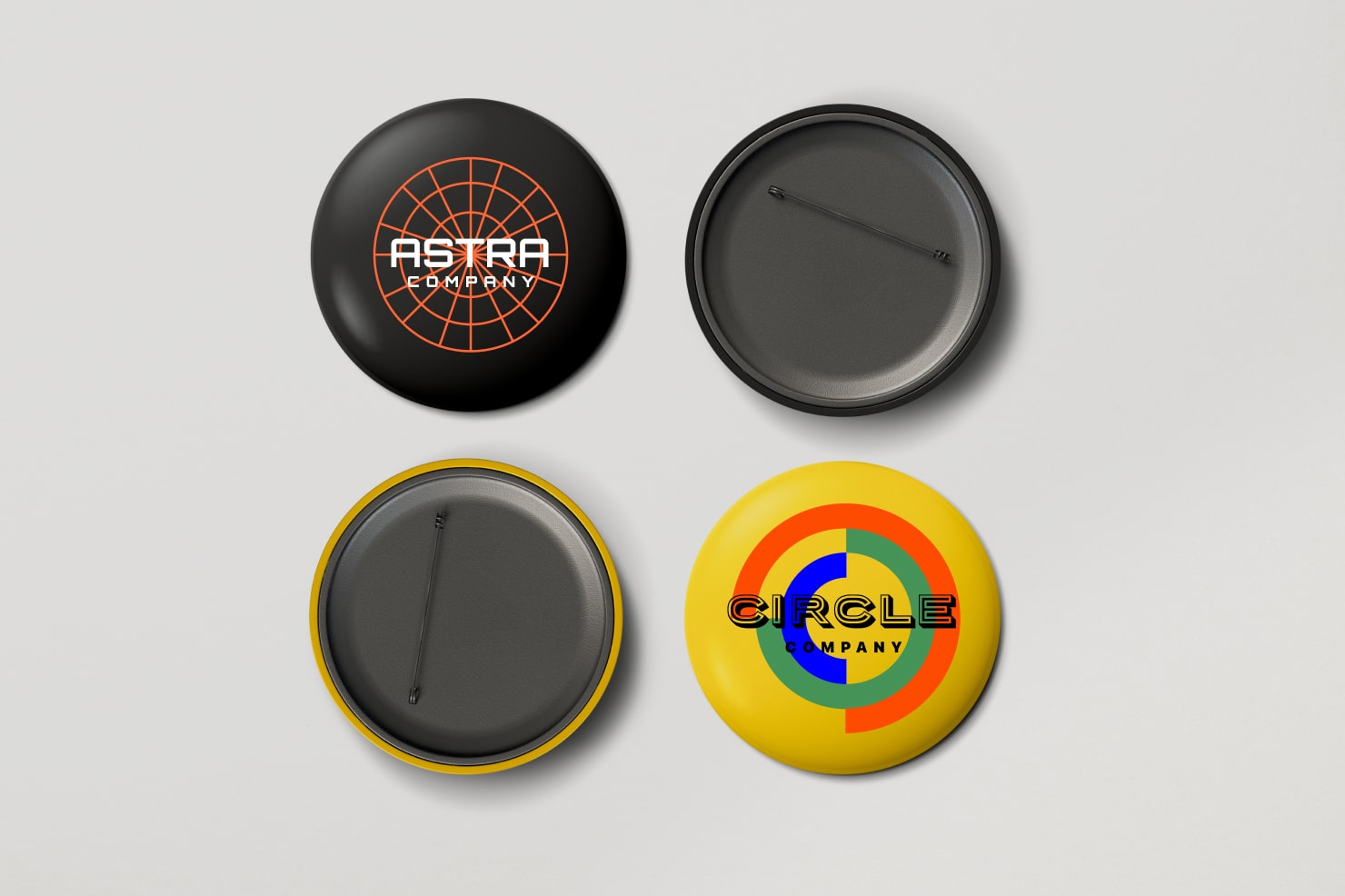
For a lot of events, people like to include a logo or relevant branding elements on the name tag. Make sure logo placement doesn’t overwhelm the name or other essential information. Resize the logo proportionally to maintain visual harmony with the rest of the design. Consider placing the logo at the top or bottom of the name tag. Placing the logo in the background is not optimal, because it can interfere with the text.
Text Alignment & Spacing
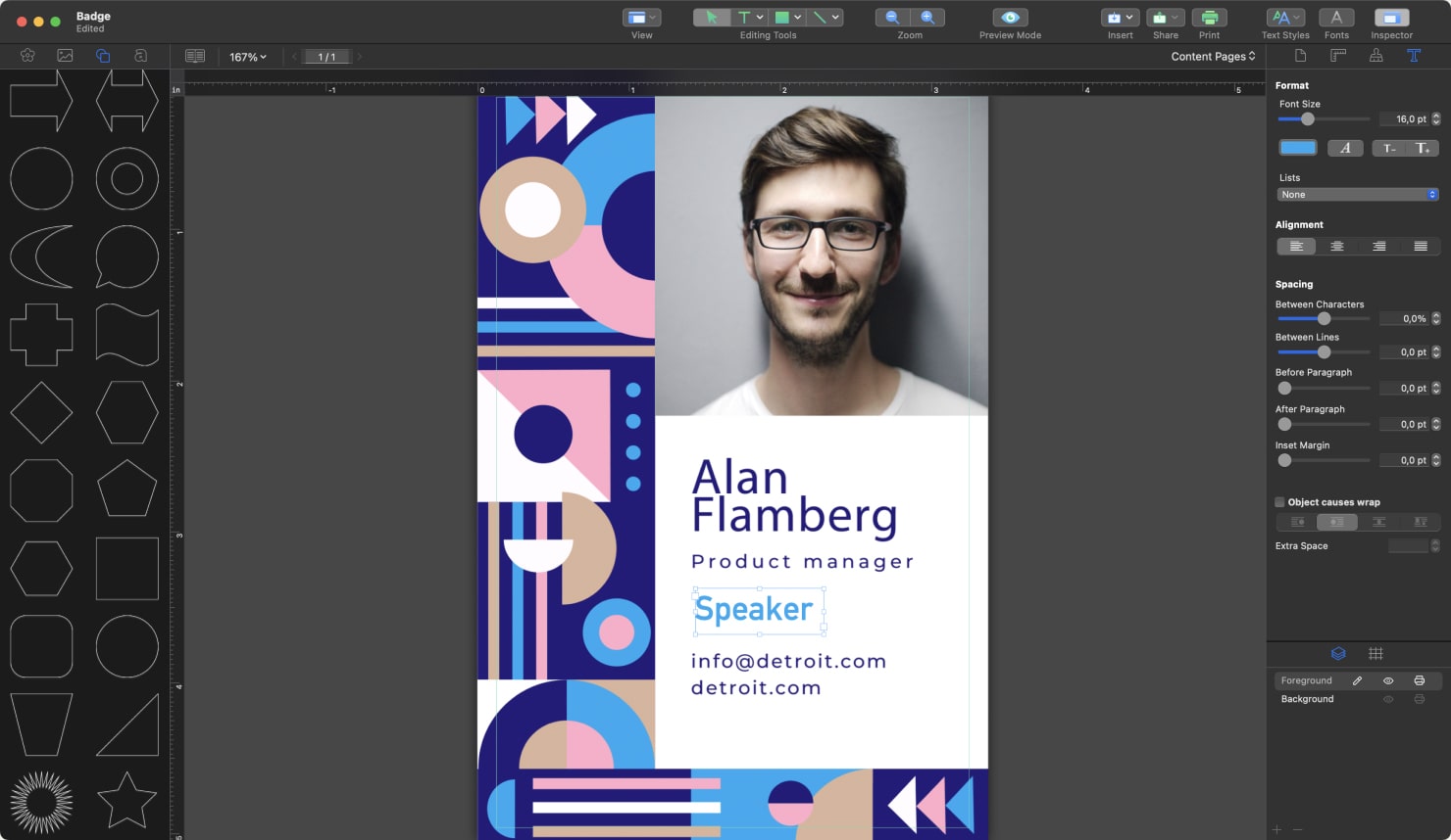
Align the text elements on your name badge to create a clean and organized look. Center-aligning the name and left-aligning additional details often works well. Pay attention to the spacing between lines and elements to maintain readability. You may want to use double spacing, or 1.5-line spacing if you have several lines of text.
Conclusion
Designing custom personalized name badges is not only useful, but it’s an excellent opportunity for you to showcase your creativity and attention to detail. By considering such as purpose, material, size and shape and color scheme, you can create visually appealing and effective design.
Remember to consider font, color scheme, logo placement and text alignment for optimal results. Test a few options to make sure your name badges are easily readable.