How to Design a Custom Rack Card on a Mac
Nowadays, the number of business advertising tools can’t help but astound us. Among the most popular solutions are flyers and informative brochures. However, rack cards are also incredible business influencers.

Creativity Is Welcome
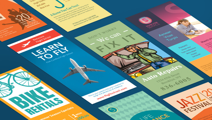
When designing a rack card, you should always remember that this type of promotional material is often distributed in public places. That means they have to attract customers’ attention quickly, clearly convey the main points and possess a certain call to action. To understand what is truly eye catching, just think about what makes you stop and read some data or grab a flyer or rack card.
Eye-catchiness is often associated with bright and colorful properties. To create really functional custom rack cards, you need to determine how your background matches the slogans and headings to be applied. It is also a wonderful idea to get to know how colors may alter consumers’ attitudes and influence their moods. For instance, red tones will look appealing and bold and make your target audience believe that information printed on this type of file is urgent, up-to-date and essential.
If you want your project to stand out among the competition, then it’s critical to use highly qualitative graphics, photos and images.

Informative Efficiency
To design your own rack cards in a qualitative manner, you should bear in mind the functionality of the final product as well. If it is a beautiful piece of paper but lacks important data to influence customers, you have wasted your time and money. To avoid this mistake, consider the purpose of your project.
You aren’t obligated to provide details on the card such as when your business was founded or how many goods you sell or produce. The main purpose is to interact with your target audience. For instance, if a business has some promotions or discounts, it would be a nice touch to include this data on the rack card layout.

Don’t hesitate to prepare more than one rack card design. This will allow you to determine which option is more informative and effective in your marketing campaign.
Let Me Introduce Myself
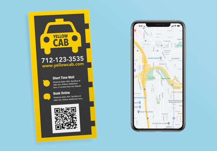
Apart from a call to action, rack card templates on a Mac must include your business contact details; otherwise, your audience won’t be able to find your business fast and effortlessly. Here are some of the things a company might mention in the Mac layout:
- Google Maps to your office;
- Open business hours;
- Links to social media accounts or business emails;
- Special promotions;
- QR codes.
It is also critical to proofread your template on the Mac. It would be a huge mistake to miss spelling or grammatical errors. Pay attention to details to increase your customers’ overall awareness of your brand.
