Designing the Perfect Christmas Party Invitations: Font, Color and Layout Tips
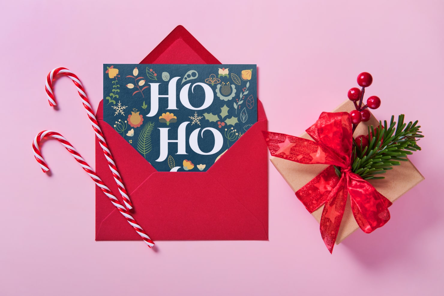
The Christmas season is a time for joy, festivities and gatherings with loved ones. One of the most anticipated customs of the season is hosting Christmas parties. Whether it’s for a few close friends to share a fancy dinner and or dozens of relatives for a family meal and a gift exchange, everyone looks forward to attending these fun occasions. And one of the things guests appreciate most is a thoughtful invitation sent in the mail. Opening a red envelope, and finding a beautifully designed card inviting you for an evening of festivities will put anyone in the holiday mood. In this guide, we’ll explore the elements that make for the perfect Christmas party invitations: fonts, colors, and layout. We’ll also give you tools and resources for you to design your own invitations easily.
Choosing the Right Fonts
When designing Christmas party invitations, choosing a font is one of the first decisions to make. Fonts set the mood and give guests a sense of what to expect for your event: will it be formal dress, with food served on fine china? Or will it be laid back and casual with a buffet table? Perhaps your gathering will be outdoors singing Christmas carols, or making some barbecue. Each type of party warrants a very different font, so here is a quick breakdown of what fonts suit different occasions.
Script Fonts for an Elegant Touch
Script fonts offer graceful, cursive styles, and display elegance and sophistication. They are perfect for formal gatherings, such as black-tie Christmas parties or evening dinner soirees. Script fonts don’t have to be formal, as they can also be warm and inviting, conveying a handwritten feel. If you’d like to add a luxurious touch to your invite, a script font is an excellent choice.
A few script fonts to consider are:

Serif Fonts for a Traditional Look
Will your party be full of classic traditions? Perhaps you’ll sit around the fire, sip hot mulled cider and eat holiday cookies. Serif fonts would convey this timeless tone for a gathering. These are versatile and can work well for family gatherings or office parties.
A few serif fonts are:
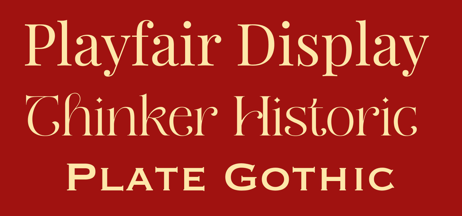
Sans-Serif Fonts for Modern Invitations
If you’re planning a contemporary Christmas gathering, sans-serif fonts are the way to go. Add a clean, minimal aesthetic to casual, trendy events with fonts that are simple and uncluttered.
Top choices for sans-serif fonts are:

To take your holiday invitation to the next level, consider experimenting with specialized artistic effects like Gold Foil or 3D Snow. For more inspiration, check out these creative Christmas typography ideas.
Legibility Considerations for User-Friendly Design
While the style and visual beauty of the font in your invite is important, it’s also essential to think about legibility. After all, the main goal is to convey information about the party to your guests. To make sure your invites are readable, keep in mind font size and spacing.
Font Size and Readability
The size of the font is critical to recipients’ ability to read it. Generally, it’s helpful to not choose anything smaller than 12 point, although in some fonts even 12 point would not be easy to read. A good standard is to hold your invitation at arm’s length and check whether the main details can be read, or if the words seem to disappear. When in doubt, choose a larger size font over a smaller one.
If you’re pairing two font sizes, make sure the main information, like date, location and time is in the larger font, to make sure it’s quickly and easily understood.

Spacing and Line Height Adjustments
Correct spacing and line height are crucial for readability. Ample spacing between lines and around blocks of text makes the words clear and easy to read. With enough spacing, guests can skim details without having to focus too much on each word. If you choose a crowded font, you can easily remedy this by adjusting the spacing between letters—the kerning—slightly.

Balancing Text and Background
You’ll also want to make sure your text color is legible against the background color. While most colors are legible against a white or ivory background, you’ll have to be more selective if your background is dark green or black.
Font color should be high-contrast against the background color so it is legible. Colors that are opposite on the color wheel generally provide enough contrast to be read. For example, red can be read easily against a green background.

Christmas Invitation Colors
After the font selection, the color choices for your Christmas party invitations are the second element that sets your event’s tone. Here are some classic color combinations and tips for creating a color palette.
Red and Green: Classic and Timeless
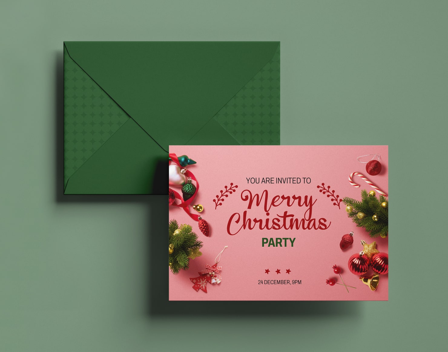
Red and green are the traditional Christmas colors, and you can never go wrong with this pairing. They represent the tradition of holidays of the past and present, and warmth of the season. These colors have special psychological significance as well. Red evokes excitement and warmth, and green is used for balance, harmony and renewal. This combination is perfect for a cozy, traditional Christmas gathering.
Blue and Silver: A Cool and Elegant Option
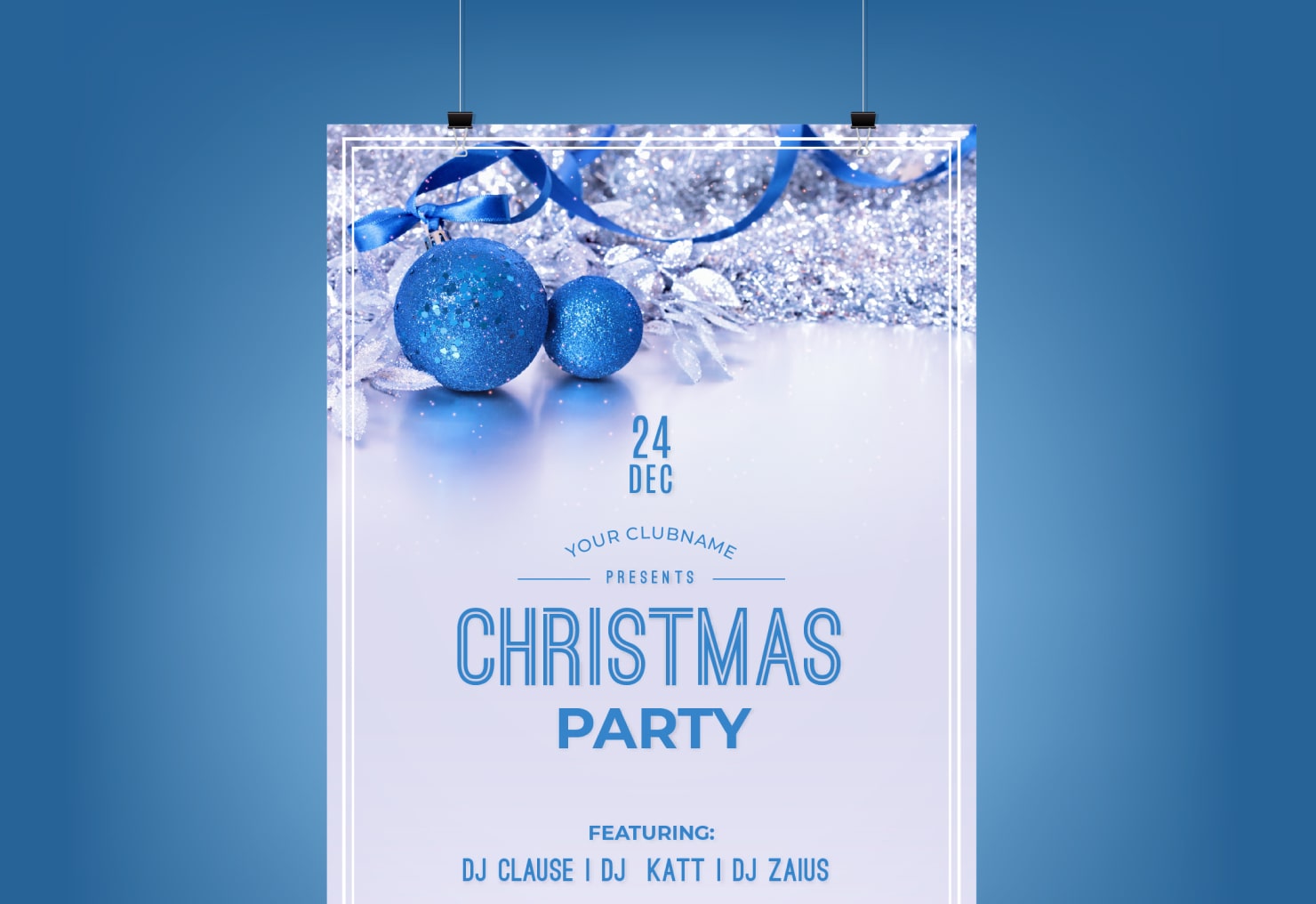
Blue and silver are unexpected but fitting choices for a sophisticated party atmosphere. These colors reflect the snowy, serene and magical side of Christmas, making them perfect for an elegant party. And when it comes to emotions, blue is said to bring out calmness and sophistication. This is a good pairing for a relaxed but still elegant festivity.
Gold and White: A Touch of Luxury
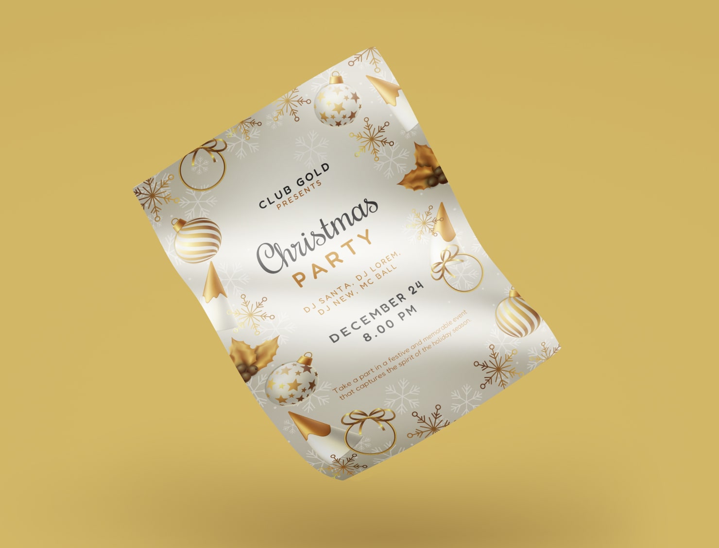
Gold and white are a color pair that gives off an air of luxury. For glamor and an air of opulence, these colors are a strong choice. In color psychology gold evokes not only wealth, but joy, warmth and happiness. White conveys purity and a sense of space. These two colors combine perfectly for an upscale event.
Creating Your Unique Color Palette
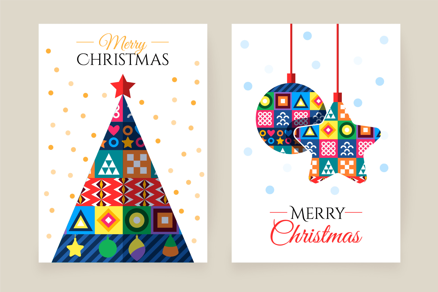
It is also fun to create a unique color palette that suits your event’s theme. You might choose complementary colors, like blue and green, or use unexpected hues that match your personal style. Colors are just one element of your invite, so using Christmas illustrations or drawings can give a holiday feel to any color palette you choose.
Mastering Layout and Composition
Layout and composition of your Christmas party invitations also play a role in guiding the reader’s eye and giving information about your event. Below are some considerations.
Placing Critical Information Prominently
The theme or main title of the party is what you want to feature, so make it noticeable, either through a bright bold color, a flourishing font, or a large size. The next thing your guests need to know is the date, time and location, so make sure they are prominently displayed. The guests should not have to search for important details, like how to RSVP, so ensure they are also obvious and easy to read.

Creating Visual Flow With Hierarchy
Use hierarchy in your design, giving all the information in a logical sequence. For example, make the title of the party in the most eye-catching font or a bigger font size. The date should also be in a larger-sized font, and the address in the smaller size font, and any details can be smaller and at the lower part of the page. Hierarchy and visual emphasis help guide the reader through all the key pieces of information.

Swift Publisher—Graphic Design Software for Creating Invitations
Now that you know tips on fonts, colors, layout and composition, want to know how to put it all together? Swift Publisher is a powerful graphic design software that can help you combine all the elements for a perfect Christmas party invitation. Use a template from Swift Publisher with royalty-free holiday graphics and you have a complete design suite to turn out professional-looking invitations.
Swift Publisher gives you a variety of templates and design assets that simplify the invitation design process. These templates are pre-made, so all you have to do is customize them with your chosen font, colors and images that fit your event’s theme. You can add more flair to your Christmas party invitations at no extra cost, by using royalty-free holiday images. Swift Publisher also offers loads of fonts and thousands of clip art images. These add a festive touch without the need for expensive design resources.
Printing Considerations for Christmas Party Invitations
If you decide to print invitations, considering the printing quality and paper finishes is important to help your design come to life. While you can print invitations at home, you may be limited to a thinner invitation card, and more standard matte texture of paper. A professional printer costs more, but offers a huge range of paper textures and weights, and can cut invites to any size you prefer.
Paper Quality and Finishes
Select a high-quality paper stock that complements your design. Choose from various finishes, such as matte, glossy, or semi-matte to match the party style. Consider the quality and weight of the paper too. A heavier card weight (110 lb and over) paper conveys luxury and class—and also costs more than typical card stock. A lighter weight paper is suitable, but you don’t want it to be too thin or it won’t be durable. Generally a weight between 80–120 lb papers will work well for invitations.
Putting It All Together—For Perfect Invitations
Creating stunning Christmas party invitations doesn’t have to be a daunting task, even if you’re not a professional designer. Software tools like Swift Publisher offer user-friendly design solutions to create Christmas party invitations easily. Take advantage of Swift Publisher and create eye-catching invitations that spread cheer and get your friends excited for the merry holidays to come!
Frequently Asked Questions
What is the best paper to print invitations on?
Bright white cardstock in the 80 lb to 110 lb cover weight range. This heavy stock provides a professional, sturdy feel and prevents the design from showing through to the back, which often happens with standard printer paper.
When should I send out Christmas party invitations?
Aim for 3 to 4 weeks before the party. December weekends in the US book up incredibly fast, so if you're hosting on a prime Saturday night, give your guests 6 weeks' notice to lock them in.
What details must be included in a Christmas invitation?
Cover the basics (Date, Time, Location) and a clear RSVP deadline. Manage expectations about food and vibe: specify if it’s “Dinner served”, “Appetizers only”, or “BYOB”, and clearly state the dress code (e.g., “Ugly Sweater” or “Cocktail Attire”).
Is it rude to send digital invitations for a Christmas party?
For casual events like a cookie exchange or potluck, it is a completely acceptable standard practice. However, for a formal sit-down dinner, a physical mailed invitation is a classy touch that sets a higher tone for the event.