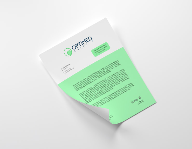
Design and Print Letterheads on a Mac
Corresponding with employees, colleagues or any third party is a common thing for companies, and every form of communication requires a brand to be personalized and unique. In this perspective, letterheads come in handy. In simple words, this is a pre-printed heading on documents. For those who would like their marketing consistent and recognizable, these details can’t be omitted.

Choose the Necessary Size and Shape
As a rule, letterheads are located at the top of a layout and typically include the sender’s personal name and address. Another thing to place in this part of the document is a company logo. It is a nice idea to implement your traditional organization’s colors to tie the design elements of the letterhead together.
The file will either be printed or sent in its digital form; there are a few size options available. Of course, custom dimensions are always an option, but 8.5 by 11 inches, or standard letter size, is the preferred choice.

Take into account how the branding relates to the medium. In most cases, there is one template that an organization uses for all their correspondence. That means it should visually adapt to different-sized text boxes.
However, if you see there is not enough space for the required information, it is still not recommended to adjust your letterhead heavily. Brevity is the soul of wit.
Select a Theme
Your company is welcome to have a couple of letterheads for different partners and occasions. Why not add some holiday elements when it is Christmas or Easter time? The main thing to remember is that your template has to be appropriate for the letter’s purpose.
It is a trendy design idea to use muted colors for your layout. Brands aren’t obligated to use strict tones and too formal a design even in keeping with standards of business communication. You won’t be breaking any rules if you add more brightness and contrast to the header, border and even body text (to highlight key elements, for example).

Geometric patterns will suit various styles and complement your letterhead layout. Along with implementing the psychology of color techniques, carefully consider the meaning of shapes that you want to include. For instance, squares and rectangles are believed to add more tradition and balance to your message, while a rhombus will convey a more contemporary and vibrant tone.
If you seek inspiration, check out Swift Publisher’s collection of over 500 ready made templates. They include company header samples, fancy personal letterhead designs, simple letterhead formats and much more. Enthusiasts are welcome to use the theme that matches their objectives or even create one from scratch.
Personalization
Apart from using logos, icons and other elements to incorporate the company’s branding, images will help make such a project stand out. That doesn’t mean you should use a photo of your organization’s building as a letter background, but it is a nice touch to add bright pictures at the bottom of your page.
Customers can also add a colorful border. It may be either a tone that is complementary to your traditional choices or a shade that suits the overall color schema of the template.

As a riskier option but still functional, you may choose a particular color for your letterhead format. This decision will make your design recognizable at quick glance. In turn, you have to consider the general readability and visibility. It is not enough to make a letterhead on a Mac with bright colors—the essential task is to ensure that the visual content does not interfere with the meaning of the message.
Not only are black and white contrasts attention-grabbing, but so are combinations of white and blue, maroon and peach, navy and light gray, etc. In order to create brochures and color-oriented projects like letterheads on a Mac, color find features will help equip Mac users with the tools they need.
Typography Influence
Without a doubt, letterheads are text-centric. Once again, you shouldn’t forget that even a simple letter will represent an image of your brand, and it is up to you which message you would like to share with your audience. The approach to typography is similar whether you create a letterhead or a brochure on your Mac.
Take into account how efficient the use of professional software will be. Consumers will complement their designs, implementing 3D letterheads and vector graphics techniques. Please note that Swift Publisher can integrate with Art Text, an advanced program for creating artistic heading presets.
Work with the Results
Once you have achieved a satisfactory letterhead layout on your Mac, it is a time to save it. Solutions like Swift Publisher allow customers to download and share files in different formats. If you plan to print your Mac creation, PDF would be a great option.
At the same time, the program provides you with more scalable and adjustment capabilities to ensure printing won’t damage your project. It is as simple as ABC to comply with print shop requirements by selecting the right specifications of a color model.

When you decide whether CMYK or RGB is required, feel free to opt for the special Text to Curves feature. Using this function, consumers can submit their file to a corresponding institution without any concern for font or heading incompatibility.