Choosing the Right Font for Your Brochure and Flyer
Brochures and flyers are one of the key marketing pieces that help businesses tell a wide audience about their service. These pieces are some of the important ways that people become familiar with businesses, services or events that are publicized. So choosing the right font for your brochure or flyer is critically important for publicizing the message.
The fonts used determine how readable the text in the pieces will be overall. But it can also visually reinforce the purpose of the business. Do you want your brochure to convey the seriousness and stability of your business? Or should the brochure convey beauty and aesthetics? As you can imagine, the fonts for a brochure about financial services should look quite different from the ones in a brochure about beauty spa treatments. The font will carry the look of a brochure or flyer, so choosing the right one for the information you want the reader to know is essential.
Take advantage of our brochure maker to create compelling, stylish brochures in minutes.
Serif Fonts
Serif fonts are characterized by little decorative strokes that mark the ends of the lines of letters. The small strokes, sometimes called “feet” are referred to as the “serifs.” Serifs can help make a typeface more readable, especially when the font size is small, so they are often used in media with paragraphs of text, like books or magazines. One of the most common serif fonts used in print is Times New Roman.
Serif fonts work well for titles of brochures, especially when paired with sans serif fonts or the ones without the decorative strokes at the ends of lines. In addition, some serif fonts are a good choice if a brochure will have longer blocks of text, because they offer good readability, even when letters are relatively close together.
There are a number of different serif fonts that are excellent options for brochures. One of the most popular is Playfair, an elegant font that adds a touch of formality. Playfair is characterized by a high contrast between the thickest and thinnest parts of the letters. It is ideal for headlines or main points of a brochure.

For brochure titles, Lora is a serif font perfect for large size text or attention-grabbing headlines. Lora has risen in popularity over the past few years, likely because it pairs well with other sans-serif fonts. It is considered to be balanced, with brush-style curves that are reminiscent of calligraphy.

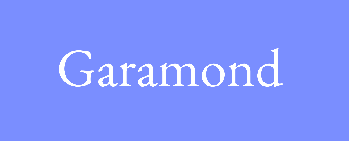
Garamond is one of the oldest fonts, with origins dating back to the 16th century. Named after a French engraver, it has been used in many historical texts and books, thanks to its readability. Today Garamond continues to be used in many printed works and would be well suited for brochure text. Garamond is a great choice to convey history and tradition, with an elegant air.
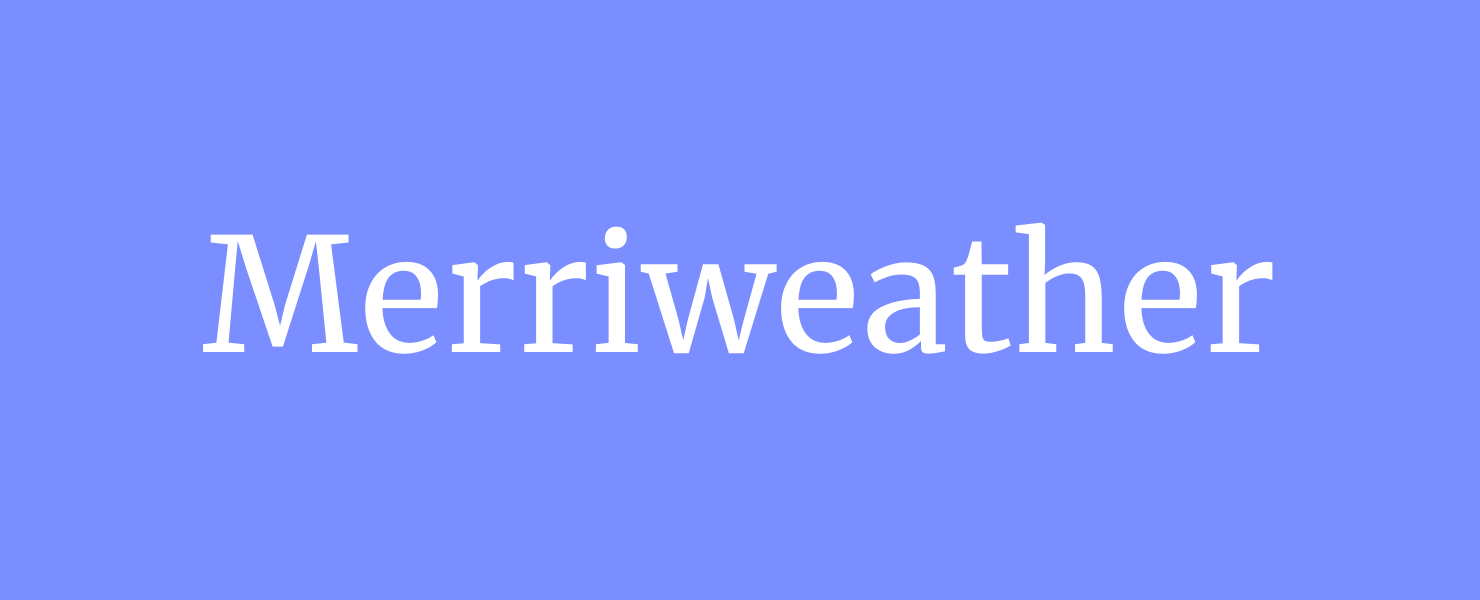
Merriweather is a versatile serif font with good legibility and slightly condensed letter shapes. This is a good choice for text in a brochure. It has a classic look, and was actually influenced by the Garamond font. It's simple, readable style makes it neutral enough to convey formal or casual information.
Sans-Serif Fonts
Sans serif fonts are those with no decorative strokes at the ends of letters. They offer clean, simple lines and lend a modern, minimalist look to printed materials. They have the advantage of being “cleaner” and more modern, as they were developed long after serif fonts. Though they have been around for decades, sans serif fonts can help convey a feeling of being more current or hip.
Roboto is a more recently developed sans serif font, designed for screen use in 2011. Since then, it has become popular for print use as well. It is characterized by straight-sided capital letters, and for balanced letters that do not appear as compressed together as other fonts. Roboto is excellent for headers on brochures, because of its more spacious letterforms, but it can also be read easily as text in shorter paragraphs.

Montserrat is a sans serif font ideal for headlines, thanks to its slightly geometric and modern look. In brochures, Montserrat could convey a clean, simple aesthetic. This makes it versatile enough for lines of text to give information. It is one of the most widely used fonts, thanks to its easy readability.

Raleway is a thin weight sans serif font that conveys elegance and refinement. With a polished and minimalist look, Raleway is a perfect choice for headlines. This font tends to draw the eye to look closer, because it is thin yet very readable.

Another excellent sans serif font for brochures, especially for headlines, is Oswald. It has clean lines, and the letters appear slightly long and narrow. Oswald stands out when bolded, for headlines or text to get a reader’s attention. On a brochure, it pairs well with Garamond or Times New Roman, the more classic traditional fonts.

For a cool vibe and a modern sensibility, consider using Arimo, a sans serif font that is a good all around choice. It’s strong enough for headlines on a brochure, but could work equally well in lines of text as it is more condensed than Montserrat, for example. Arimo pairs well with Lora to convey a style-conscious brand or company.

Display Fonts
Display fonts are a group of fonts meant to be written in large sizes like heading and titles, or words that are meant to attract notice, like on a billboard. Display fonts are often decorative and are meant to catch the reader’s eye, so they are not used for blocks of text. Using display fonts sparingly in your layout can really help create a unique look.
On a brochure, choose a display font for the main title on the front of the brochure. When making a flyer, use a display font to state the main point of the flyer. If a brochure or flyer has paragraphs of text, a good strategy is to use the display font for heading, or for the first line of text, to break up the paragraphs. Visually dividing information in this way can help your reader process the information. The reader's eye is immediately drawn to the display font, so it can give a preview of the text to follow.
Playfair Display is a serif font mentioned above, that also includes a display weight. This is a familiar and recognized decorative font. It is a strong, serif display font, versatile enough for casual and fun or more serious materials. Playfair is a classic font, and would be ideal paired with Roboto or Montserrat for a nice font balance between noticeable and simple.

TT Travels Next is a current and trendy display font, with a wide, stretched look to the letters and exaggerated curves. If you’re looking for a fresh, modern look, try pairing this display font with a simple sans serif font, like Arial or Raleway.

ACMA is a cool display font that is on the forefront of trends in design. This is a modern display font, influenced by Japanese mid-century design. ACMA boasts unique letter shapes that “balance crisp lines with fluid letterforms.” This display font pairs well with a straightforward serif font, like Lora.

Charmist is another playful display font that has a fresh, current look. This font is ideal for logos or branding on a flyer or brochure. As a serif font, it offers an all-caps version that makes a real statement. With its retro 1970s vibe, this font would pair well with sans serif fonts like Raleway or Roboto.

Script Fonts
Script fonts are decorative fonts that are more like handwriting in design. They should be used sparingly in brochures, since script fonts are not as readable. Script fonts have a wide variety of applications, but overall are designed to be beautiful rather than legible. If your brochure advertises a classical music concert, or a formal dinner event, a script font is a must, at least for a headline or two.
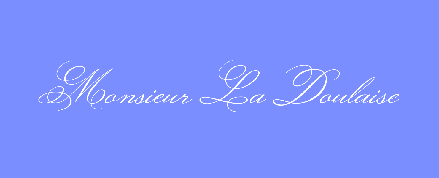
A script font that would work nicely on a brochure is Monsieur La Doulaise. This is a Google font reminiscent of handwritten copperplate calligraphy. It is a natural choice for elegant, classic events, like charity dinners, formal lectures or celebrations honoring a guest of importance.
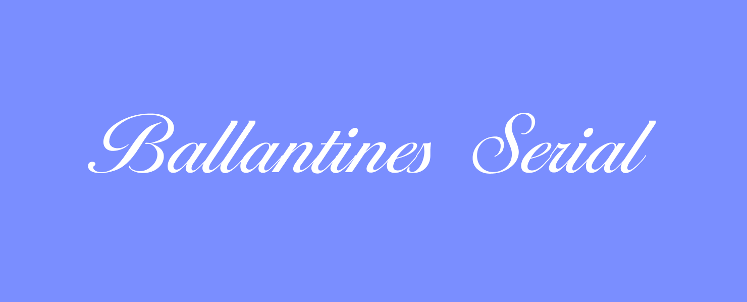
Another script font that is suitable for formal occasions is Ballantines Serial, designed by Softmaker. This font features the slant of handwriting, with a consistent line weight and elegant curves. Ballantines Serial works well for brochures that feature upscale branding, such as high end event designers, or fancy restaurants.
Sofia is a script font that is reminiscent of grade school cursive handwriting. Sofia has a playful air, perfect for children's events like plays or school carnivals.

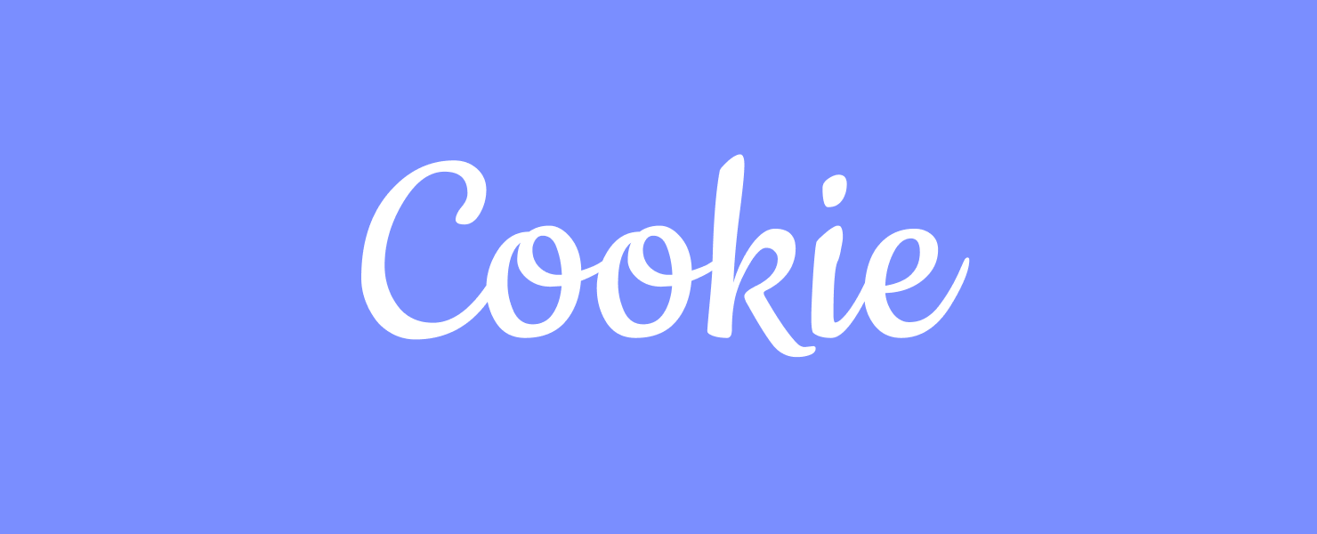
For a casual script font, a fitting choice is Cookie, a Google font. This has rounded letters, and a retro feel. This is a perfect font to use for brochures that don’t have to convey serious, professional information. While it would not suit text conveying financial information, for example, Cookie would be ideal for marketing fun parties, beauty-related services, or anything with an air of nostalgia.
Pairing Fonts
Knowing what fonts to pair is a critical element of designing a brochure that is readable and understandable. In design, a best practice is to pair sans serif with serif fonts for a cohesive and attractive brochure design.
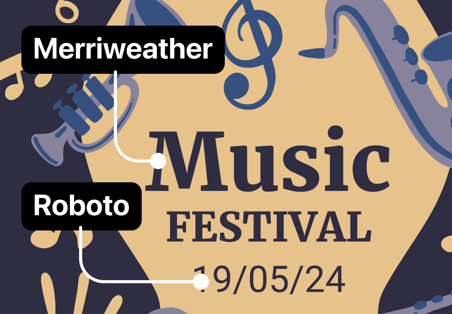
For example, if the headings or titles of a brochure are in a serif font, then consider using a sans serif for the text. If Merriweather is used for the main titles and headings, pair it with Roboto for a balanced look. Or pair Garamond with Arimo, for a clean, easily legible overall look.

Or pair a flourish script font with a simple, serif font to highlight the most important text. Using Ballantines Serial with Playfair is a nice pairing for an event, with the main points in the script, and Playfair used for details like the description and date.
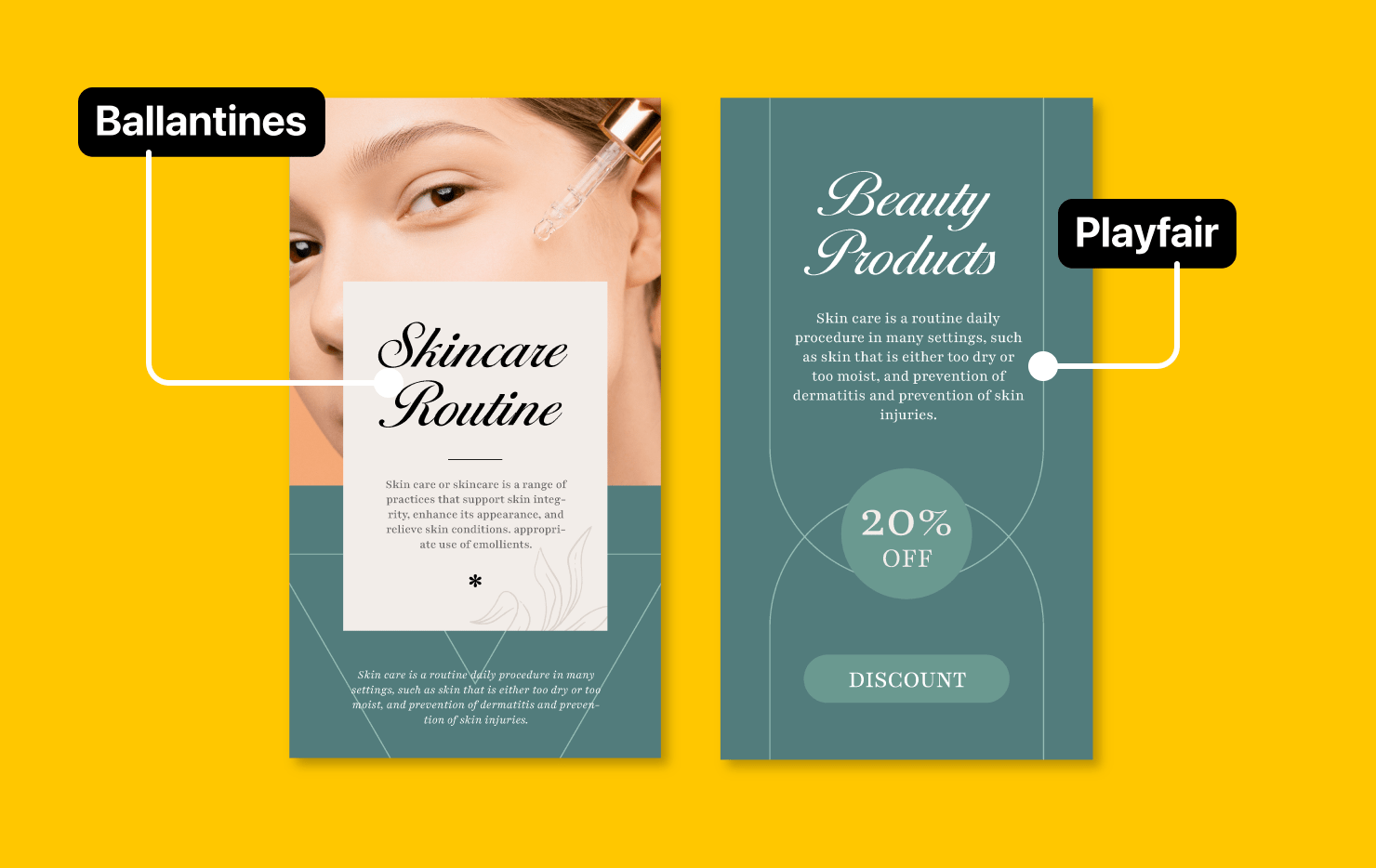
Pairing two distinctly different fonts keeps the main points more visible and recognizable, and makes paragraphs of text readable. An overall design with two contrasting fonts adds consistency and helps a brochure look professionally made.
Conclusion
Fonts play a big part in the effective design of a brochure. Choosing one that can convey information, while also capturing the “feel” of your company, event, or service is an art. The font sets the tone of the information and helps your reader understand unwritten information that is conveyed visually.
Serif fonts offer many options for legibility and a traditional, classic feel. Sans serif fonts overall offer a more modern sensibility, with cleaner, minimal lines. And for more flair and personality, Script fonts also have a place in brochures, when used more sparingly. Pairing fonts together helps your reader separate the most important points from the details, so it breaks up the information. Experiment with pairing fonts from different categories to find which two combine to give just the right impression.
Fonts not only make or break the visual attraction of a brochure, but they contribute to making an impression on the reader. Spend time to choose the right fonts, and your promotional materials will stand out above others in the overall marketing landscape.